I do hate to waste a good cover
Aaaand we’re back from vacay, slightly better rested but no less curmudgeony about our go-to media neuroticisms, namely today: the wasting of a good magazine cover, which in our humble opinion is what’s going on with this latest New York mag issue:
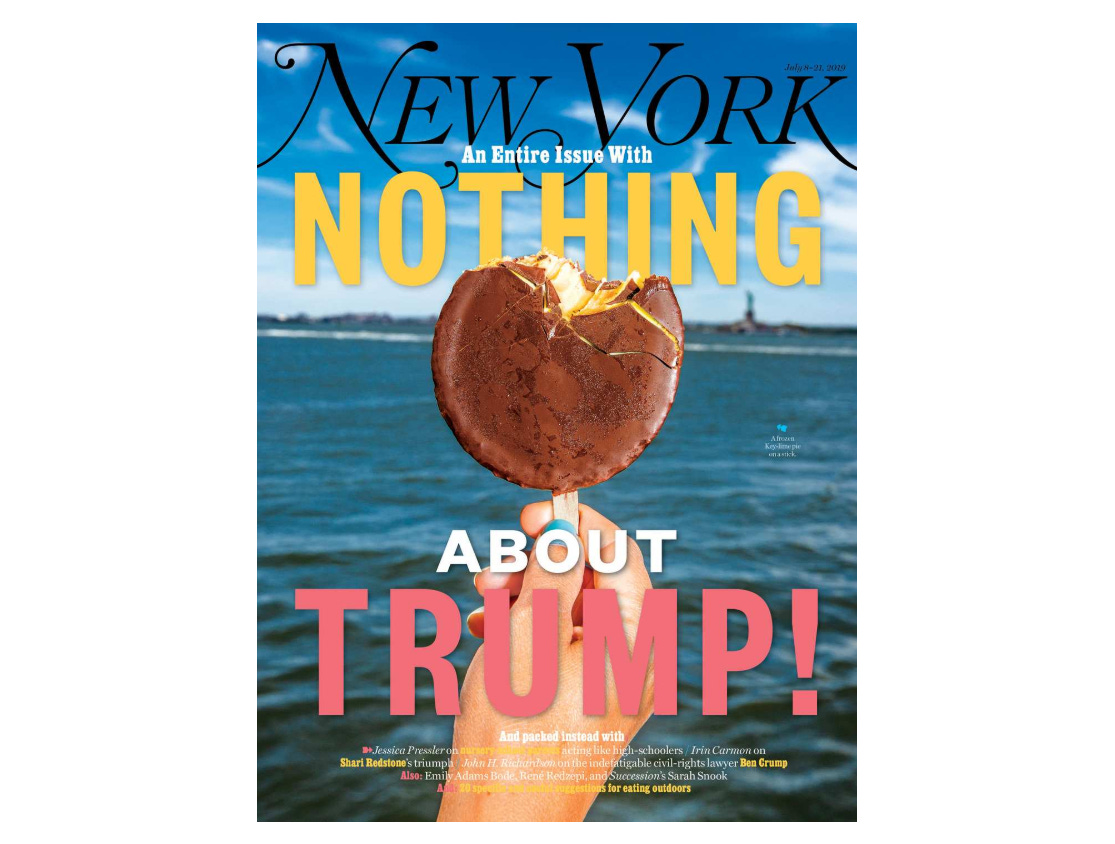
Magazine covers are still some of the best attention real estate out there in the industry, and New York has consistently done some absolutely exquisite ones (the cover of the Cosby accusers was unforgettable, obvi, and that Pete Buttigieg profile got a v. funny 40 Year Old Virgin-style send-up).
PLUS, they still have the connex with Bobby Doherty (the former staff photographer responsible for this epic kids-in-couture-making-a-fuckin-mess shoot).....................so what’s the deal with this phoned-in cover that effectively tells us nothing about the actual issue / puts the good stuff all in yellow font on a skin tone background / looks like 90% of all the posts on your Instagram timeline after all your visiting tourist friends ~discover~ a Mr. Softee truck for the first time???? We <3 you New York, but give us something figuratively more delicious, please!
(H/t to @karacut for bringing this to our attention!)